The Ukrainian Sense Foundation (USF) is a civic organization that works in cooperation with IT companies to implement innovative solutions for communities at the legal level. While IT specialists develop technological products, USF takes on the legal and operational aspects, ensuring compliance with legislation and the successful implementation of projects. Their expertise includes digital transformation consulting, process reengineering, and policy development. USF supports government institutions, local authorities, and international donors in shaping and implementing nationwide reforms.
Challenges
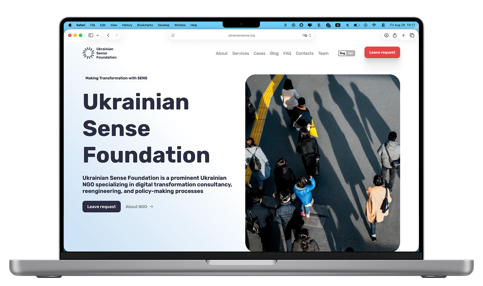
The main challenge was the sheer volume of expert content that needed to be presented clearly and accessibly for multiple audiences: government agencies, partners, and the general public. Another task was to create a modern yet official style that would highlight the organization’s expertise. Navigation had to remain simple and intuitive for users seeking specific services or cases while still accommodating large amounts of content and diverse blocks.
Additionally, the website needed to function as both a digital business card and a lead-generation tool, with a feedback form designed for clients arriving via marketing campaigns to submit consultation requests.
Process
We started with analytics and an in-depth exploration of Ukrainian Sense Foundation’s activities to understand how to properly communicate their values. Based on this research, we developed an information architecture and built a sitemap with a clear page structure and well-defined content hierarchy.
The design struck a balance between official formality and modern style. We selected a restrained color palette, concise typography, and visual accents that highlighted key messages.
For development, we used a modern tech stack to ensure speed and stability. The website was optimized for mobile devices and search engines, and we integrated a content management system powered by a custom admin panel built on React.js, allowing the USF team to update the site independently.
Solution
We created a clear structure that makes it easy to find information about the organization’s activities, services, and implemented projects. A dedicated case studies section was added to showcase USF’s expertise in action. The admin panel provided full control over all content – from small UI details like button labels to entire articles – ensuring flexibility for the client.
The site was optimized for high performance and fully adapted for all devices, including desktop, tablet, and mobile.
Design
The branding was based on a dark blue palette symbolizing stability and trust, complemented by coral-red accents. We drew inspiration from documents: dark blue folders and red pen underlines became the visual metaphor. The style combined hand-drawn graphic elements to emphasize humanity with precise geometric forms to convey structure and clarity.
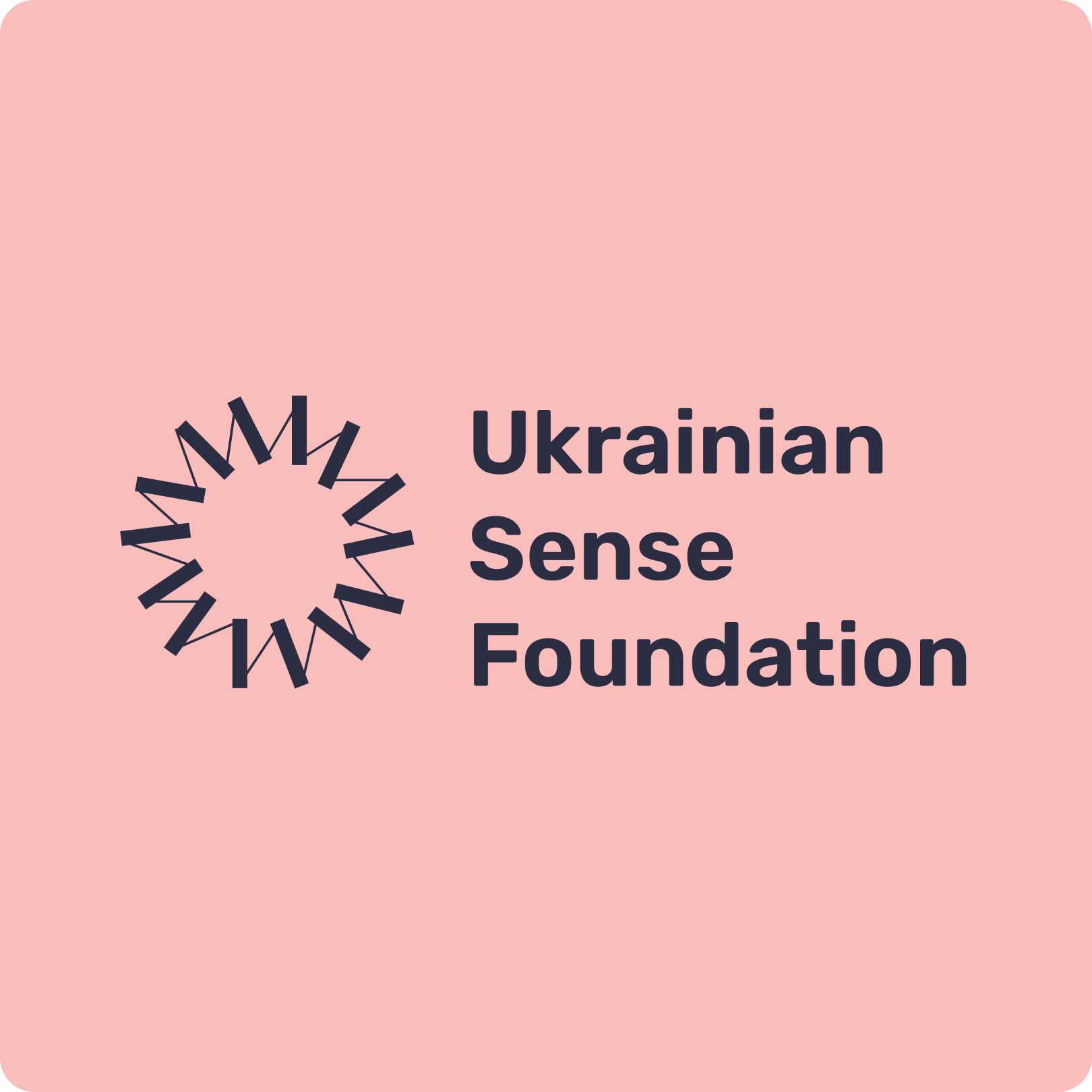
We also generated and integrated high-quality images of people and workflows to highlight the human involvement of the USF team in client projects. The logo consists of rectangular shapes resembling document folders and a sun element, also used as an animated loader. This symbolizes continuous improvement and the transformation of services into tangible results.
Results
The new website became an effective communication tool for the Ukrainian Sense Foundation. It reflects the organization’s expertise and helps partners and institutions quickly understand USF’s role, while providing evidence of competence through case studies, analytical materials, and articles.
The project proved that even organizations with large volumes of complex content can have a modern, simple, and intuitive website that serves as both a digital business card and a strategic growth tool.
USF gained a modern identity and website that embody its mission and values. The client highlighted the speed of delivery and the quality of collaboration. Thanks to its new digital presence, Ukrainian Sense Foundation has strengthened its role as a key partner for government, municipal, and international institutions seeking systemic and effective transformations.
LozahStudio


Ukrainian Sense Foundation
Website and digital identity for Ukrainian Sense Foundation.
Ukrainian Sense Foundation is a civic organization that implements innovative solutions for governments and communities. We built a modern website and identity that balance formality with modern style, and developed a custom React.js admin panel for easy content management.
The stack we use
Only the latest technologies
Our projects are built using only modern and up-to-date technologies, ensuring efficiency and high quality of solutions
Check all techs
More cases
From this category
We use only modern technologies that help create fast and beautiful products.
Go to category


